
A hospital complex almost always resembles a maze: buildings, passageways, floors, elevators, identical corridors, and similar doors. The patient comes in alarm, the visitor is in a hurry, and the feeling of disorientation only increases stress and a sense of loss of control. That is why the well-thought-out wayfinding system, which includes signage, a logical space structure, color coding and clear landmarks, turns from “cosmetics” into a real tool for caring for a person.
Navigation And Emotions Of The Patient
When a person cannot find the right department, office, or elevator, anxiety grows almost automatically, even if medical care is objectively available and nearby. A clear navigation system reduces this burden: a person sees the sequence of the space, understands the route from the entrance to the desired point and distracts the staff less with questions.
Wayfinding works as a combination of several levels: an architectural plan, visual cues, a hierarchy of signs, numbering of floors and rooms, and clear messages without overloading terminology, which resonates with the principles of customer journey management, forming a more predictable path for humans. Decision making points are especially important – forks, elevator groups, stairwells, and passageways. That’s where the patient needs maximum clarity, not a chaos of arrows and signs of different styles.
Visual Landmarks And Color Coding

A person remembers not only numbers and words, but also an image. For example, the bright walls of the third floor act as an instant marker: “orange floor means third,” and color coding helps you navigate faster than a dry number on a sign. The same principles apply to designated areas where a certain color is associated with a group of departments or a route from the entrance to, say, a diagnostic unit.
However, color cannot be used without a system. Too many shades turn the hospital into visual noise and increase cognitive load. Consistency is needed: uniform rules where each color is linked to a function or zone and repeated in maps, signs, and diagrams.
In addition to color, contrast and readability are critical. Signage should be understandable to people with different levels of vision, and fonts should be large enough, especially given the growing proportion of elderly patients and visitors. Universal symbols, a predictable hierarchy of signs, a minimum of jargon and complex medical terms create a sense of simplicity even in the complex structure of the building.
Digital Tools And Continuous Improvement
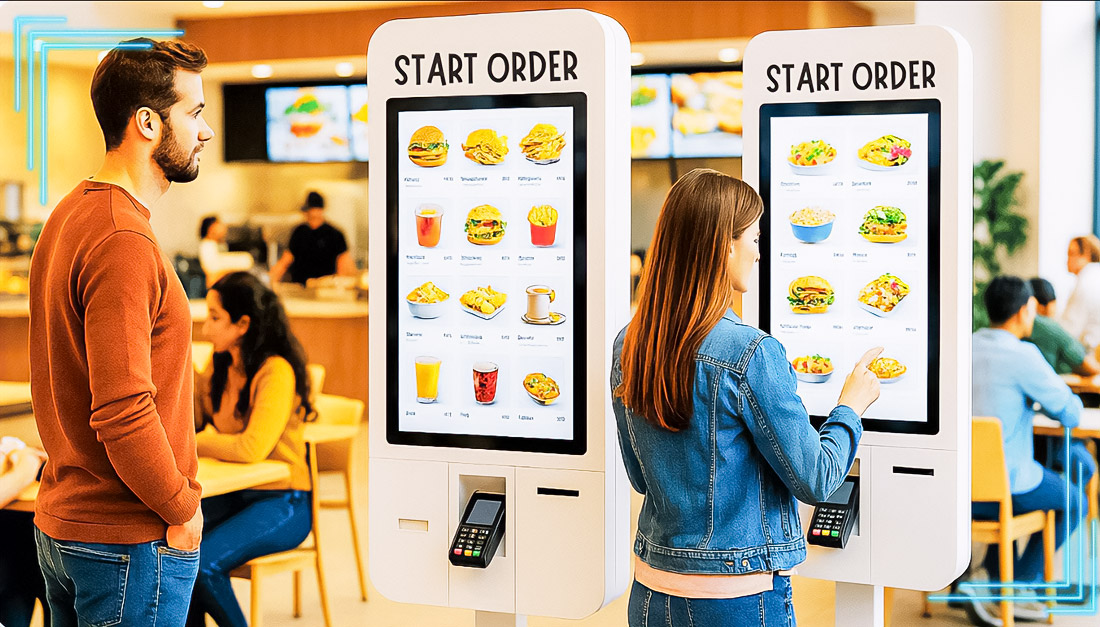
Modern hospitals are increasingly complementing traditional signs with interactive maps, navigation kiosks, and applications. Such solutions allow you to show current routes in real time, take into account temporarily closed areas, new buildings, repairs, and modified entrances. A person can get directions on the screen of the kiosk at the elevator, and then scan the QR code and continue moving according to the instructions on the phone.
At the same time, digital navigation does not negate the basic principles of wayfinding. The map is meaningless if the route itself is illogical, the transitions are not obvious, and the landmarks are not remembered. Therefore, the work is carried out on several levels: optimizing flows, adjusting schemas, updating signage, improving visibility and placement of signs.
A separate layer is security. Evacuation routes, photoluminescent markings along walls and doors, and noticeable exit signs help not only in daily operation, but also in emergency situations, such as smoke or power outages.
The navigation system requires constant maintenance and revision. The operating recommendations include a rapid update cycle, where signs and signs must be replaced within two days of a change in structure or names. The hospital collects feedback from staff, patients, and volunteers, captures typical questions and problem points, and then adjusts the numbering, routes, wording, and signage placement.
Wayfinding ceases to be a set of disparate pointers and turns into an infrastructure that supports the patient from entrance to exit, reduces stress, saves staff time and effort, and makes a complex space predictable and understandable.

I serve as a financial expert on the Today Show and Good Morning, America. I like to give reasonable advice on budgeting to people with any income level.